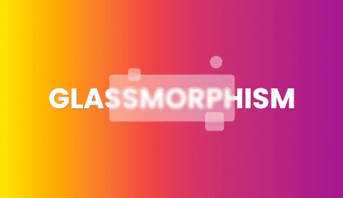
Glassmorphism - how to create in pure CSS
A short guide on how to create glassmorphic elements in pure CSS.
7 July,2021
In 2019 Neumorphism trend was horrible and awful. Michał Malewicz, the creator of Neumorphism style, wrote about something fresh and good looking - Glassmorphism style. Let's take a look at it. @Albert Wallicki.
New trend
Glassmorphism is a new trend which is getting more popular on services like Dribbble or Behance.
It's characteristic features are:
- transparency (frosted-glass)
- vivid or pastel colours
- light border
Glassmorphism - the CSS way
Glassmorphism pretty easy to achieve for frontend developers. There is one main CSS property which we can use - backdrop-filter. This property allows you to apply multiple effects such as blur, sepia, greyscale to the area behind your component. Since it applies to everything behind the component, to see the effect, you must make this element to be at least partially transparent.
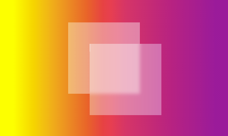
To create glassmorphism effect you should use backdrop-filter: blur().The image behind has straight background: rgba(255,255,255,0.4) . . The element above is a copy of the first one but with additional backdrop-filter: blur(10px) property.
This is the simplest example of a new trend. But we can go even further. You can add recomended by Michał Malewicz border-radius, white border and little bit more blur
Browser compatibility
The property backdrop-filter()according to CaniUse.com is fully supported by Chrome, Safari, iOS, Android Browser and Edge. Firefox is not supported by default but can be enabled.